Designer and
art director,
based in Seattle.
Currently creating
at CRISTA Ministries.
-
![]()
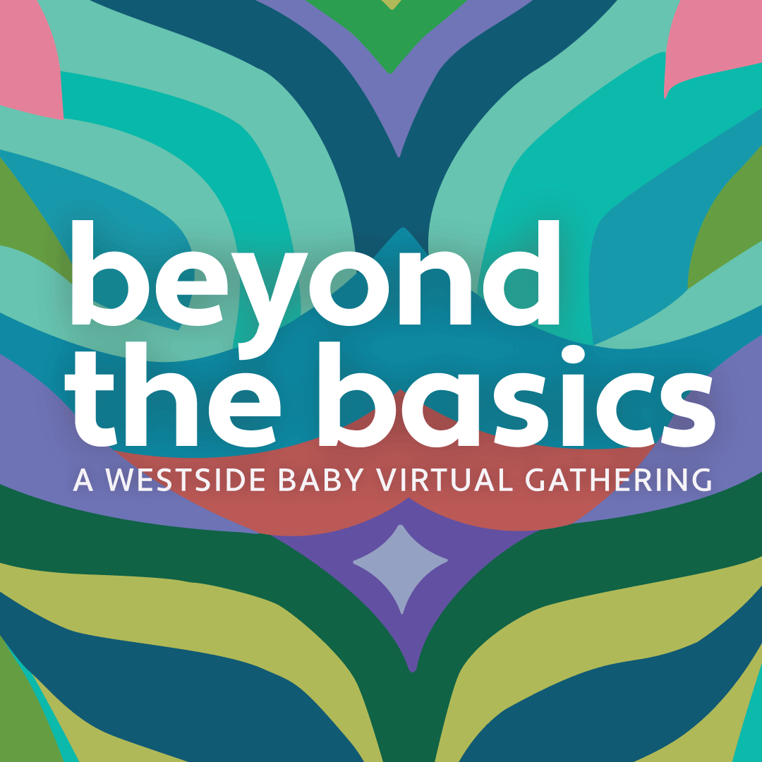
Westside Baby Fundraiser
-
![]()
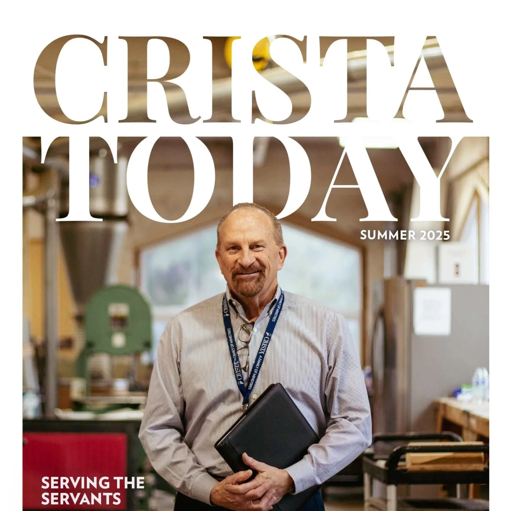
CRISTA Today Magazine
-
![]()
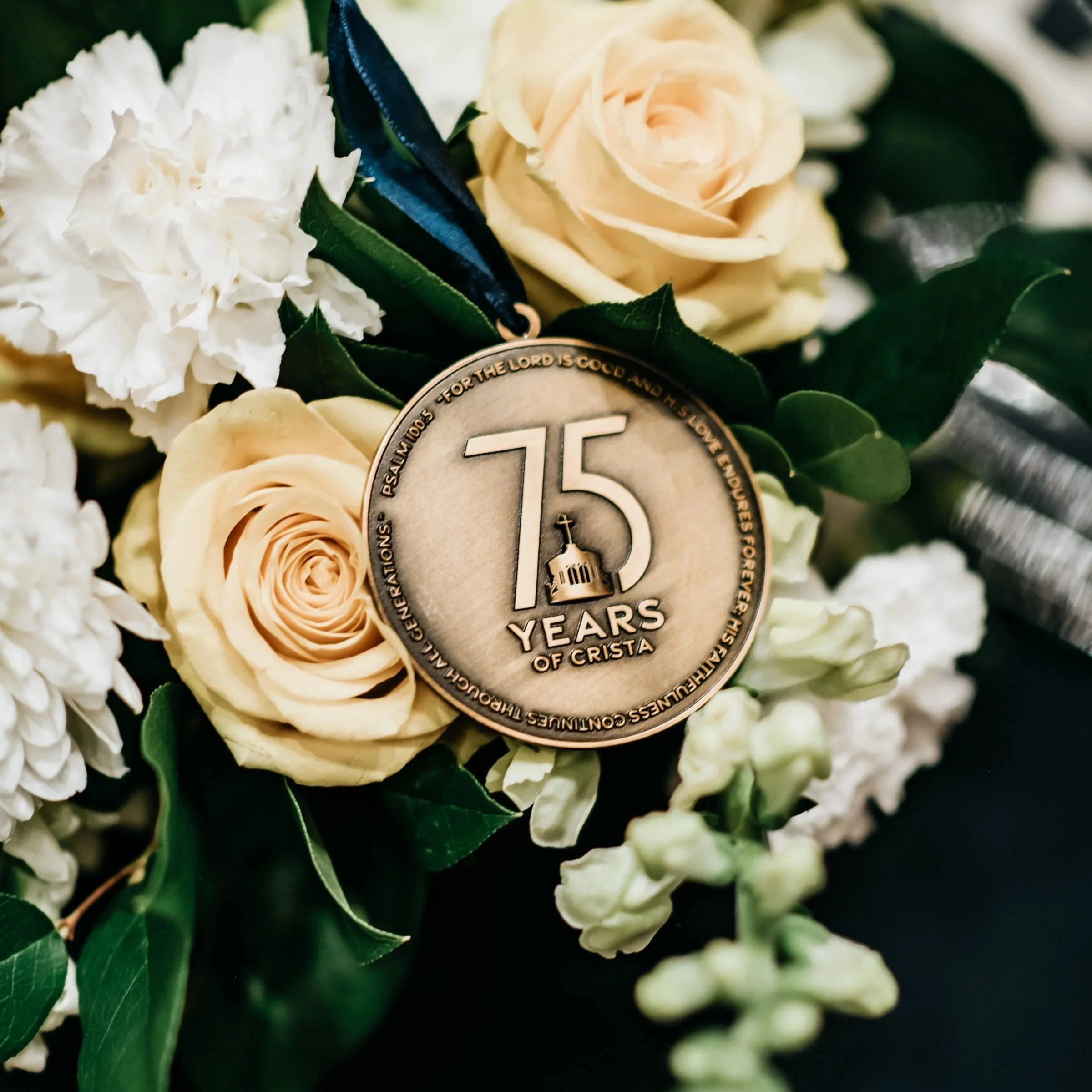
CRISTA Ministries' 75th Anniversary
-
![]()
Holy Week at University Presbyterian Church
-
![]()
CRISTA Camps Branding